Going back and forth on your interior colour scheme? We understand just how tricky paint colour selections can be. Maybe there’s a particular palette you gravitate towards but you’re not sure if it will translate well into your home. Perhaps you have a clearer idea of the mood you’d like to create but are unsure of exactly how to execute it. Or you might have absolutely no idea where to begin. And that’s okay too!
It’s no secret we’re big fans of interior design. And we’re also passionate about using bold colours to transform tired rooms into striking spaces. Paint is a great way to do that. But paint colour selection should be a fun, not scary, part of the design process. That’s why our team of homewares experts have put together some handy top tips to help elevate your interiors from drab to dazzling.
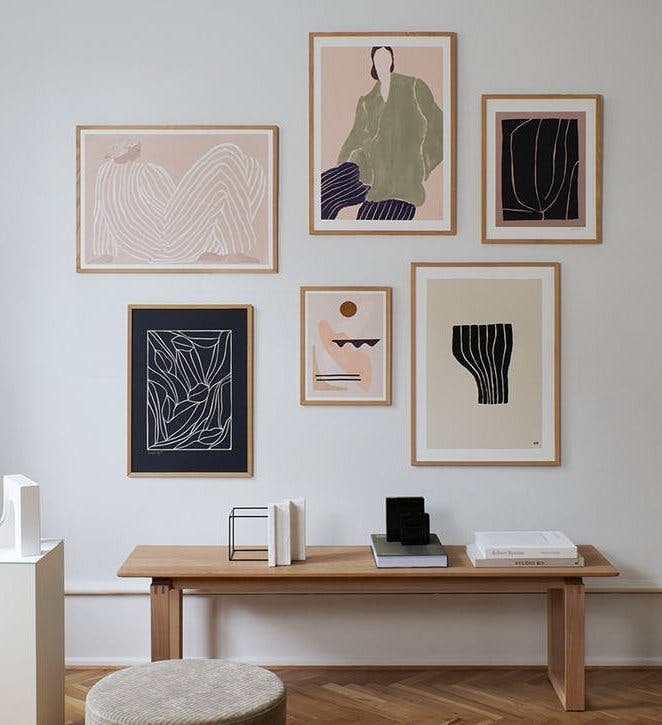
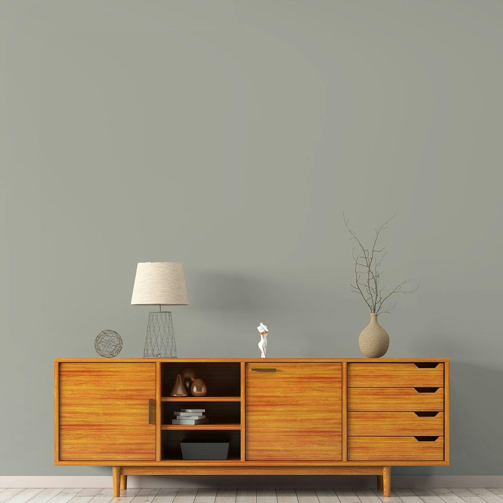
1. Seek inspiration
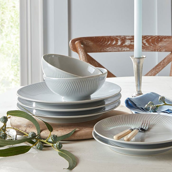
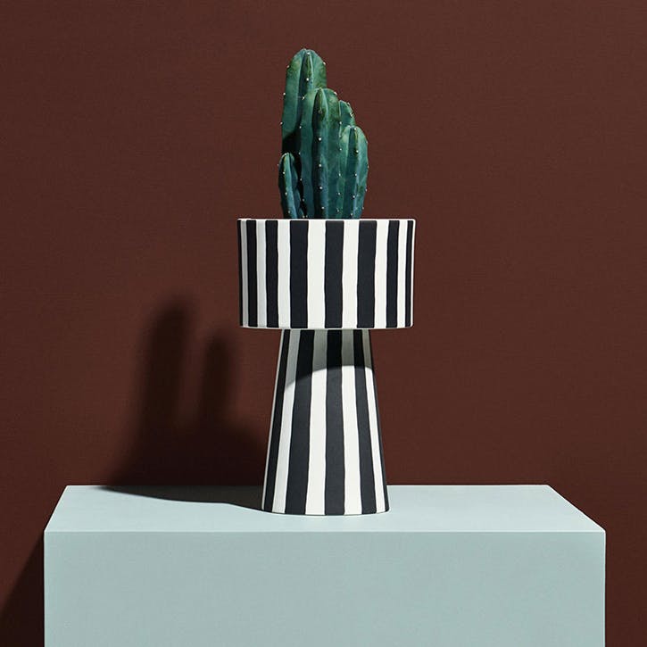
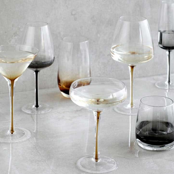
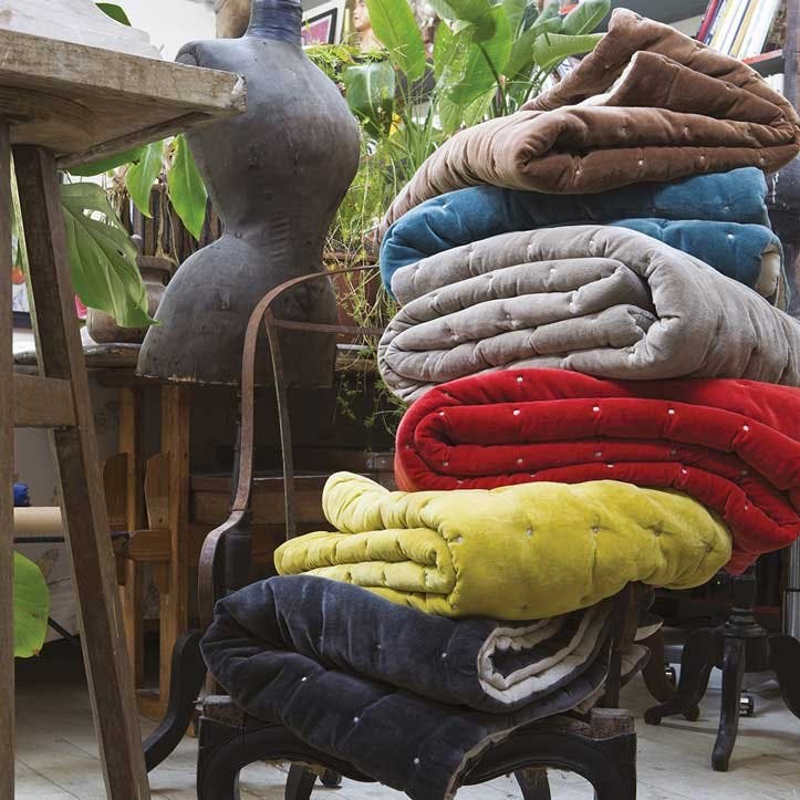
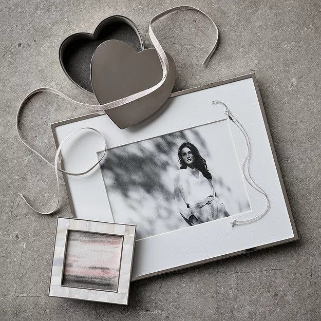
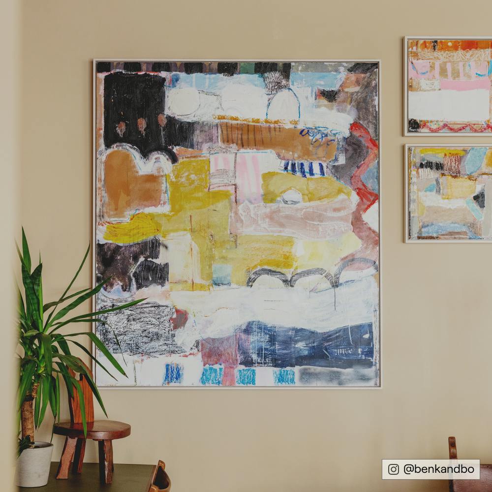
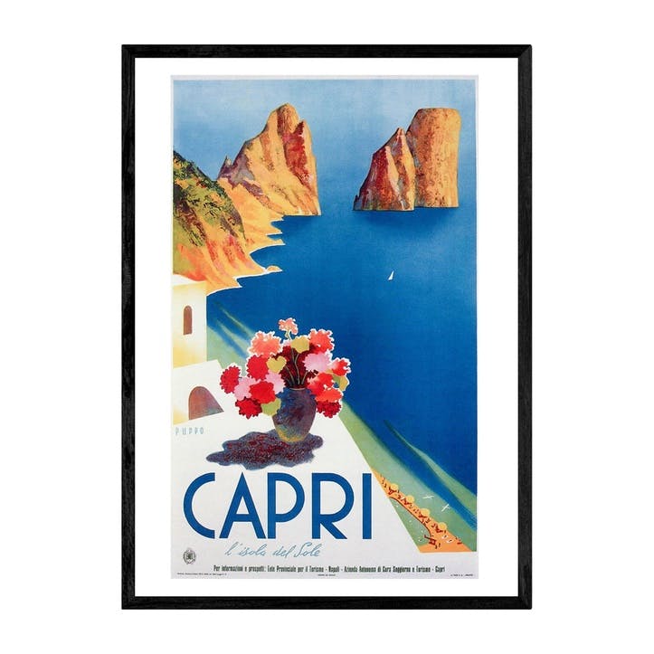
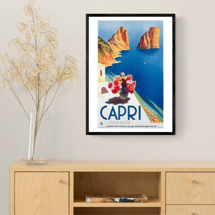
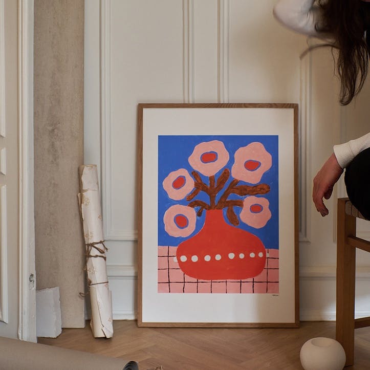
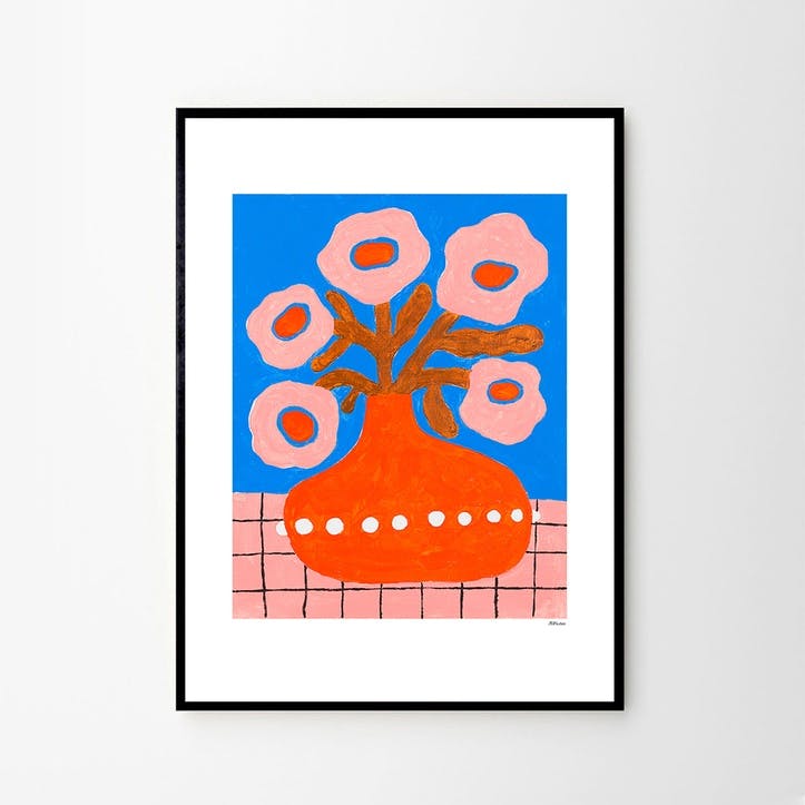
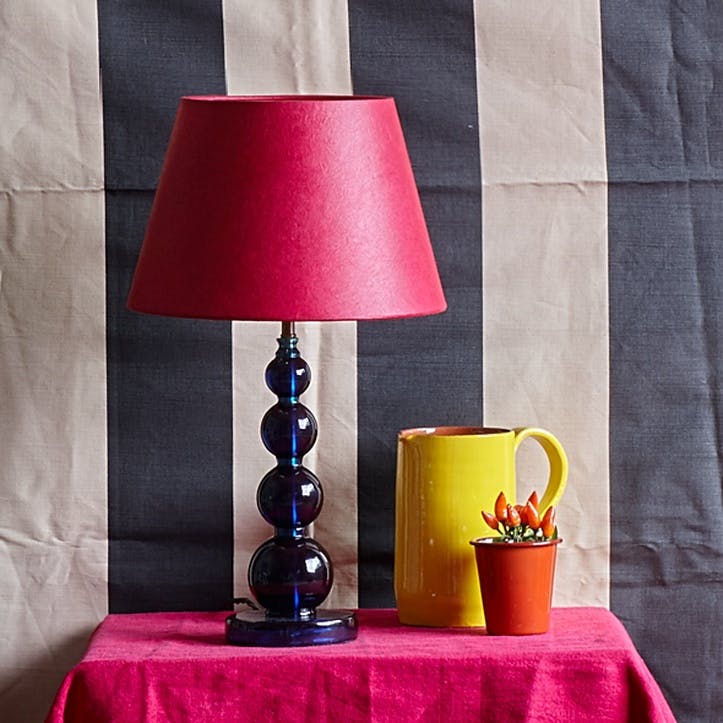
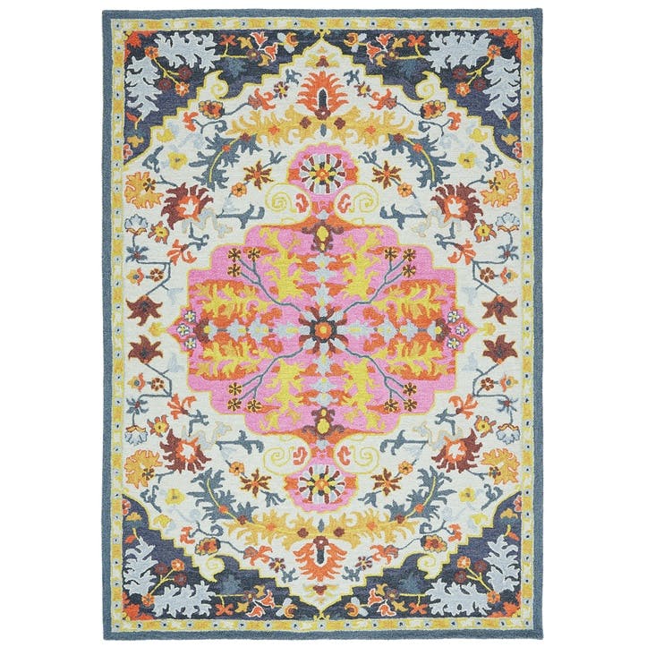
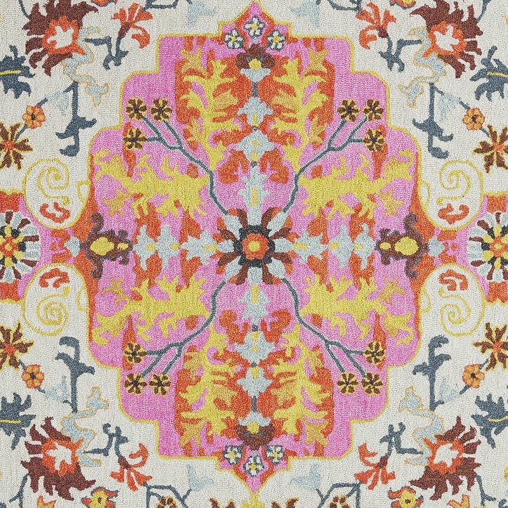
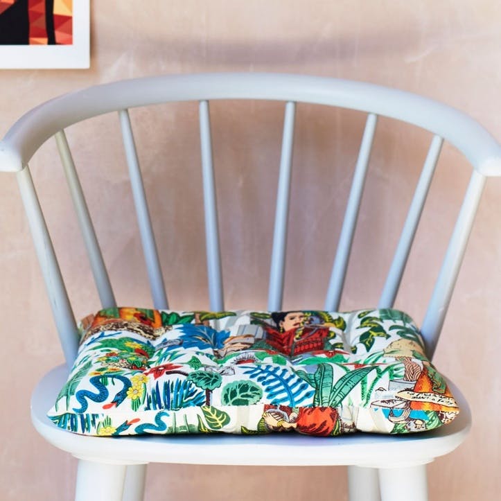
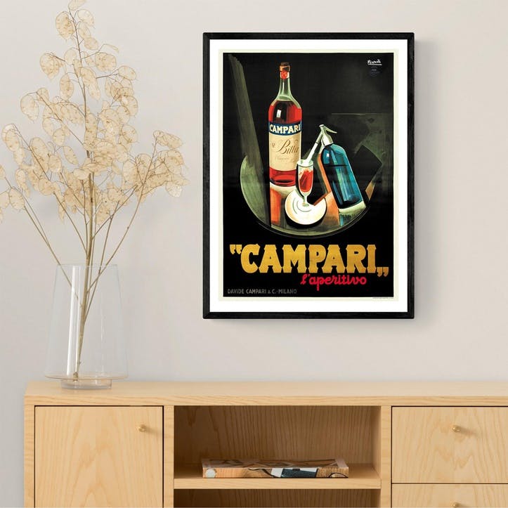
Is there a piece of artwork you just adore? Obsessed with your statement lampshade? Or is your eye fixed on a new quirky cushion cover? Identifying colours in soft furnishings, prints and other homeware accessories can be a great place to start when you’re struggling to decide on paint colour. Be sure to pull out colours and shades from existing items that will also live in the room. It might sound like a back-to-front approach but by starting with the smaller details first, creating a harmonious, well-balanced space will be easy.
I am going to make everything around me beautiful - that will be my life.
-Elsie De Wolfe
Get inspired


2. Consider the mood
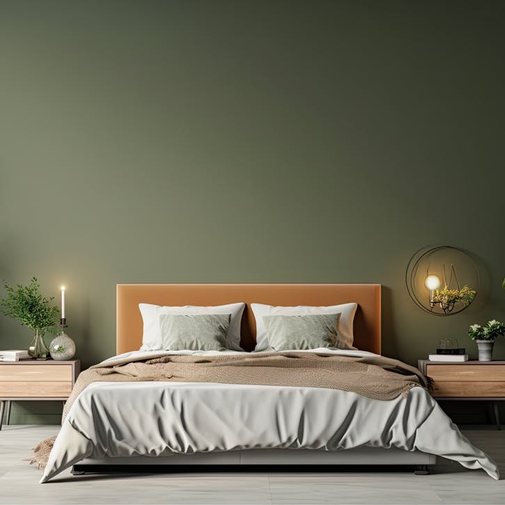
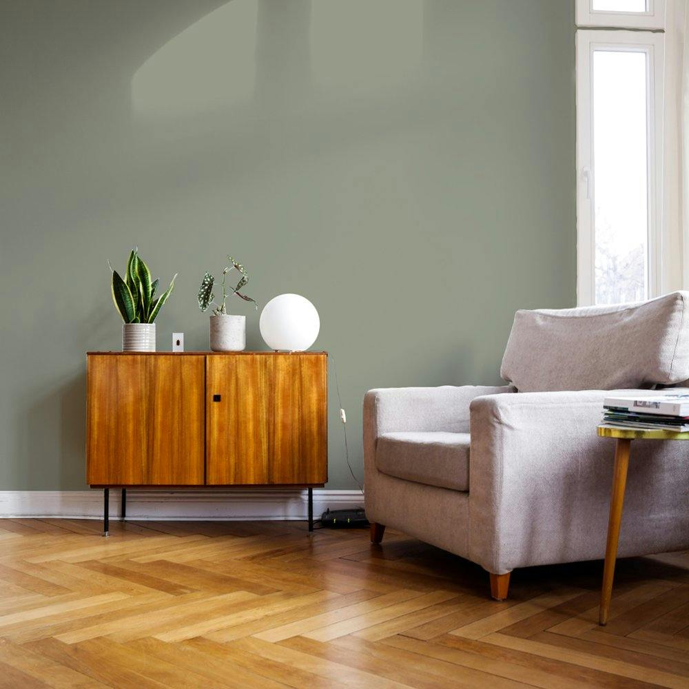
Next, ask yourself how you want to feel in the room you are painting? What is the space used for? The psychology of colour is a real thing. Pink is associated with romance and creativity. Light blue is widely considered to have a calming effect on the mind. Dark green is known to create a restorative and soothing atmosphere. There’s no denying the link between colour and mood. As the Artist Kadinsky said, "colour is a power which directly influences the soul."
Why not try our colour personality quiz and find a paint colour as unique as you are.
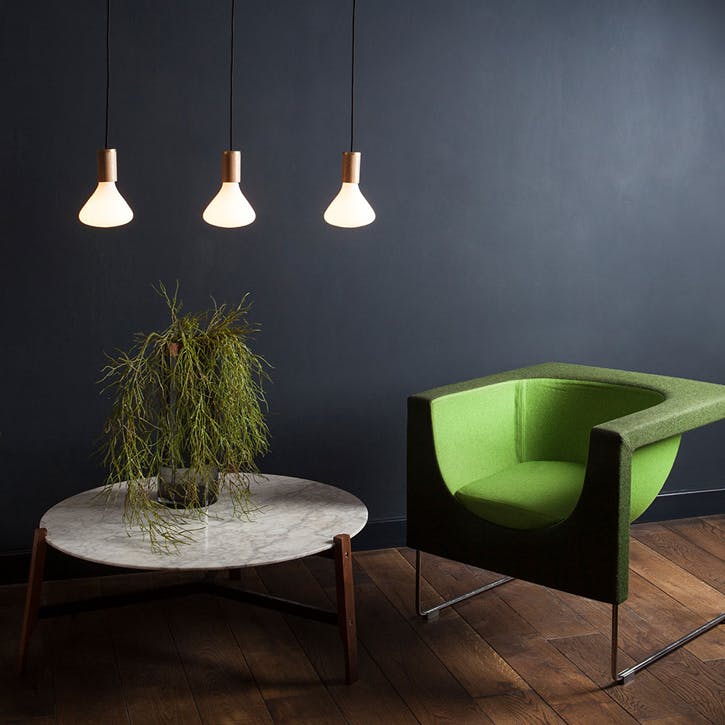
3. Be mindful to balance colours
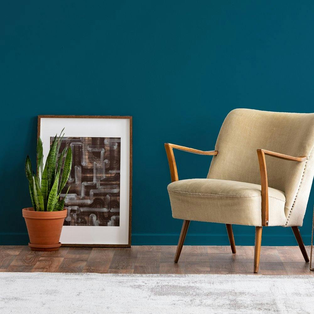
You may have heard of the 60-30-10 decorating rule. When followed, the idea is that 60% of your space should be your main colour, 30% another secondary colour and 10% an accent colour. Walls count in your 60%, as well as larger pieces like rugs or maybe even a sofa. Your 30% is typically made up from smaller painted furniture pieces, curtains and blinds, and bed linens or throws. And the remaining 10% is found in your homeware accessories or artwork. Don’t forget to create a multi-hued palette too. This means opting for one darker colour, one light colour and one bright colour to avoid a scheme looking too chaotic!
"Be faithful to your own taste, because nothing you really like is ever out of style."
-Billy Baldwin
4. Continuity is key
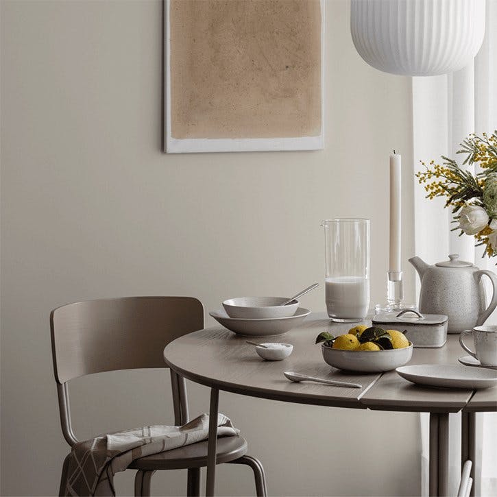
Colour selection is not just about one room. It’s important to consider your home as ‘zones’ rather than rooms. Of course, you may want the kitchen to feel different to your living room but maintaining a sense of continuity will ensure your space looks like it’s been designed by a professional. Pick paint colours that complement each other where rooms connect and create flow within zones. For example, you might opt for dusty shades across your whole downstairs space.
Need some extra guidance?
Try our short colour personality test to discover your perfect match and exclusive, handpicked homeware collections to compliment your new scheme.